Shopify
UX/UI Design
Web Design
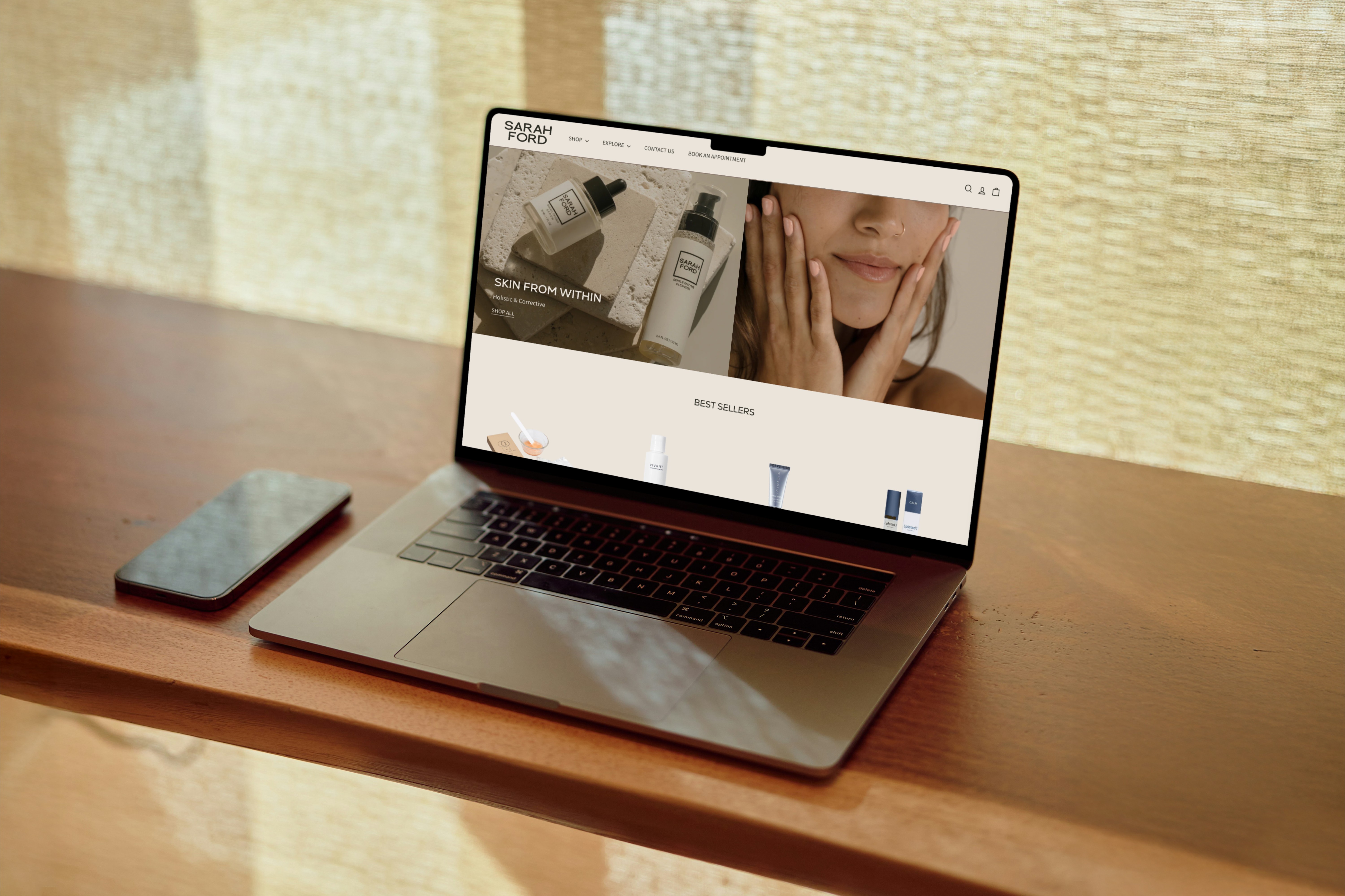
A structural and visual re-design for LA based celebrity aesthetician and skincare brand.
Role: Senior UX/UI Designer
Timeline: 5 months
Tools: Figma, Shopify
The challenge
Sarah Ford Co. was growing fast, but their website wasn’t keeping up.
The brand serves women who expect a premium, seamless experience. They arrive from Instagram, they’re informed, and they’re ready to buy, but only if the site earns their trust quickly. The existing experience didn’t. Navigation buried the full product and service offering, the homepage didn’t introduce Sarah or her namesake skincare line, and there was no clear path from landing to purchase.
It also needed to serve two different intents. Shopping skincare products and booking in-person treatments had to coexist without one getting in the way of the other.
More than a visual refresh, it needed a site that could carry the weight of what the brand had become.
Strategy & process
A brand this personal needed a homepage that could do more than sell. It needed to introduce.
I structured the narrative using the hero’s journey framework, with the customer as the hero and Sarah’s expertise as the transformation. Every section got a job: build trust, show impact, move toward a purchase.
From there I mapped a new IA that brought the full brand into view. Skincare, the namesake line, in-person services, all within a navigation that made shopping and booking feel equally accessible. I worked through wireframes into high-fidelity Figma mockups across all core pages, letting layout and hierarchy lead before any aesthetic decisions came in.


Key design decisions
Navigation
The old nav didn’t reflect how much the brand actually offers. Reorganizing it into a mega menu, by product type, brand, and curated edits, makes the full catalog feel approachable instead of overwhelming.
Homepage narrative
The homepage leads with story, not product. Each section maps to a stage in the customer journey: awareness, trust, action. New visitors get a reason to stay, returning ones get a reason to buy.
Collection page
Filtering by skin concern and routine step makes it easier to find what’s actually relevant. Less digging, cleaner path to purchase.
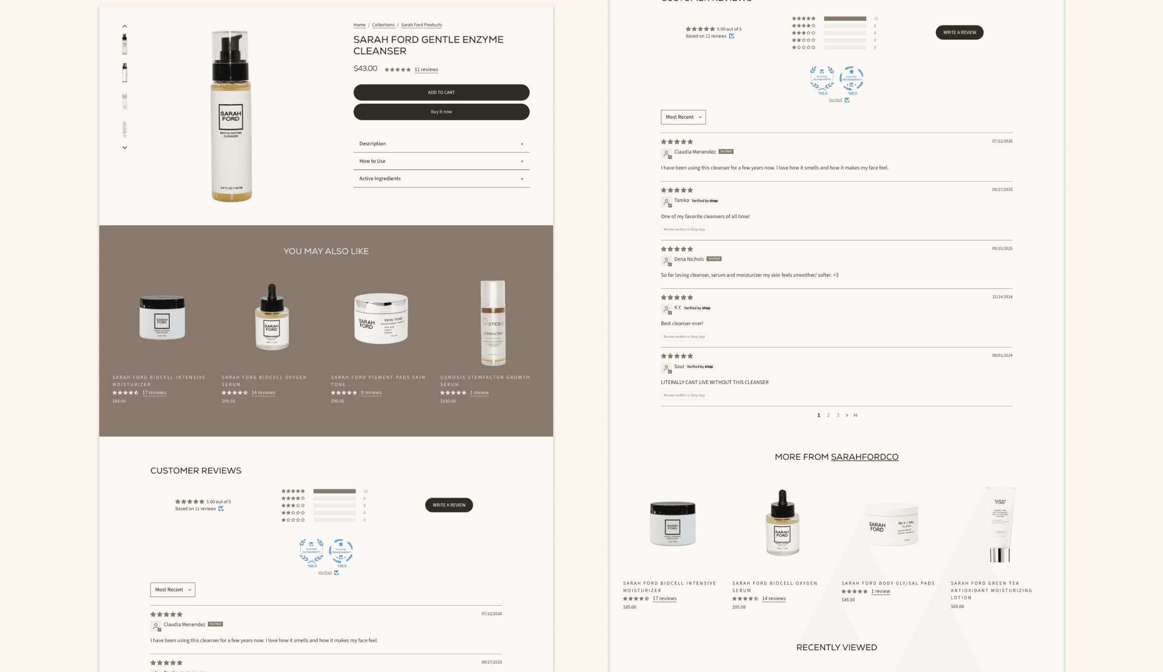
PDP redesign
Restructured to surface the most important information first. Upsell and cross-sell are woven in where they support the decision rather than interrupting it.

Navigating constraints
The project was originally scoped for three months. It ran for five.
Midway through, stakeholder changes on the client side brought in new decision-makers. Priorities shifted and alignment slowed down. Instead of absorbing the new requests into the existing scope, I held the original brief and worked with the client on a phased approach. Ship what we agreed on first, then tackle the new direction in a defined second iteration.
It kept things moving, protected what was already in progress, and got the client a fully functioning site without cutting corners.
Reflection
Projects with shifting stakeholders teach things that clean ones don’t.
If I were doing this again, I’d build alignment checkpoints into the contract from day one. Not as a safeguard, but as a shared way to keep decisions on track for both sides. The phased approach we landed on worked well, and it’s become a standard part of how I set up projects with multiple decision-makers.
Impact
The redesigned Sarah Ford Co. site launched with clearer navigation, a homepage built to convert, and a shopping experience that actually reflects the brand.
Within six months, sales were up 15%. A direct result of a cleaner path to purchase and a homepage that earns trust before it asks for anything.
Well received by the client and the team.
Let's chat
Currently booking for May 2026 and beyond.